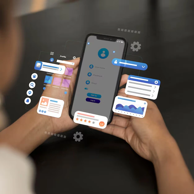
Responsive & Mobile-Friendly Design
In today’s digital world, ensuring your website is responsive and mobile-friendly is essential. A responsive design adapts to all screen sizes, offering an optimal experience for users, whether they are on smartphones, tablets, or desktops.
What is Responsive & Mobile-Friendly Design?
Responsive Design - Adjusts layout, images, and text based on screen size for a seamless user experience.
Mobile-Friendly Design - Enhances usability on mobile devices, offering faster load times and easier navigation.

Key Features of Our Service:
Adaptive Layouts - Ensures your website adjusts perfectly across all devices, maintaining a consistent user experience.
Optimized Mobile Navigation - Mobile-friendly menus, touch-friendly buttons, and easy access to essential content.
Scalable Images - Images automatically adjust for faster loading and better quality on mobile devices.
Readable Fonts - Optimized font sizes that ensure readability without zooming on any device.
Touch-Friendly Elements - User-friendly buttons and forms for a smooth touch-screen interaction.
Fast Loading Times - Image compression and caching techniques to improve mobile load speeds.
Device & Browser Compatibility - Optimized for all major devices and browsers, ensuring accessibility for all users.
Mobile-First Design - We prioritize mobile design, ensuring a streamlined, user-centric experience on smaller screens.

Benefits of Responsive & Mobile-Friendly Design:
Improved User Experience - Seamless navigation and readability enhance user satisfaction across devices.
Better SEO & Visibility - Google ranks mobile-optimized sites higher, improving your search engine rankings.
Increased Engagement & Conversions - A mobile-friendly website encourages more interaction and higher conversion rates
Wider Audience Reach - Mobile internet use is growing, and a mobile-friendly site ensures you can reach a larger audience.
Cost-Efficient - A single responsive website reduces the need for separate mobile and desktop versions.
Our Process
Consultation & Planning - Understand your needs to create a custom mobile-first design plan.
Design & Development - Build a responsive site that adapts seamlessly to any device.
Testing & Optimization - Thorough testing across devices and browsers ensures smooth performance.
Launch & Ongoing Support - After launch, we provide continuous support to maintain optimal site performance.